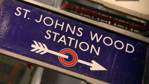
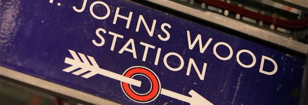
 Great look at, and revamp of, London’s 100-year-old Johnston100 typeface. Interesting how that typeface quietly defines the look of the entire city and city services, and has been doing so for 100 years. It’s getting an update, thanks to Nadine Chahine and company at Monotype. Additions include a hashtag (#), apparently not in frequent use in the early 1900s, a few modifications, and the addition of a number of thinner typeface weights. If you’re interested in type, London, or both, here’s Monotype’s article and video.


